“Abstraction forces you to reach the highest level of the basics.” – Alan Soffer
Definition of abstract: Google
adjective
abstrakt
Relating to or denoting art that does not attempt to represent external reality, but rather seeks to achieve its effect using shapes, colours, and textures.
abstrakt
Relating to or denoting art that does not attempt to represent external reality, but rather seeks to achieve its effect using shapes, colours, and textures.
My definition of abstract
Something that is unusual and unique in a peculiar way.
I think that abstract is a hard word to define because although its about the uniqueness of a photo it is also hard to put in a box because you could say any photo is unique you just have to look at it close enough to see that.
I think that abstract is a hard word to define because although its about the uniqueness of a photo it is also hard to put in a box because you could say any photo is unique you just have to look at it close enough to see that.
|
I saw that abstraction fit in the fifth threshold concept of photography because it say 'abstraction shaped' that which means to me that abstraction isn't just there its manipulated and created by the mind to interpret it in its own way.
|

|
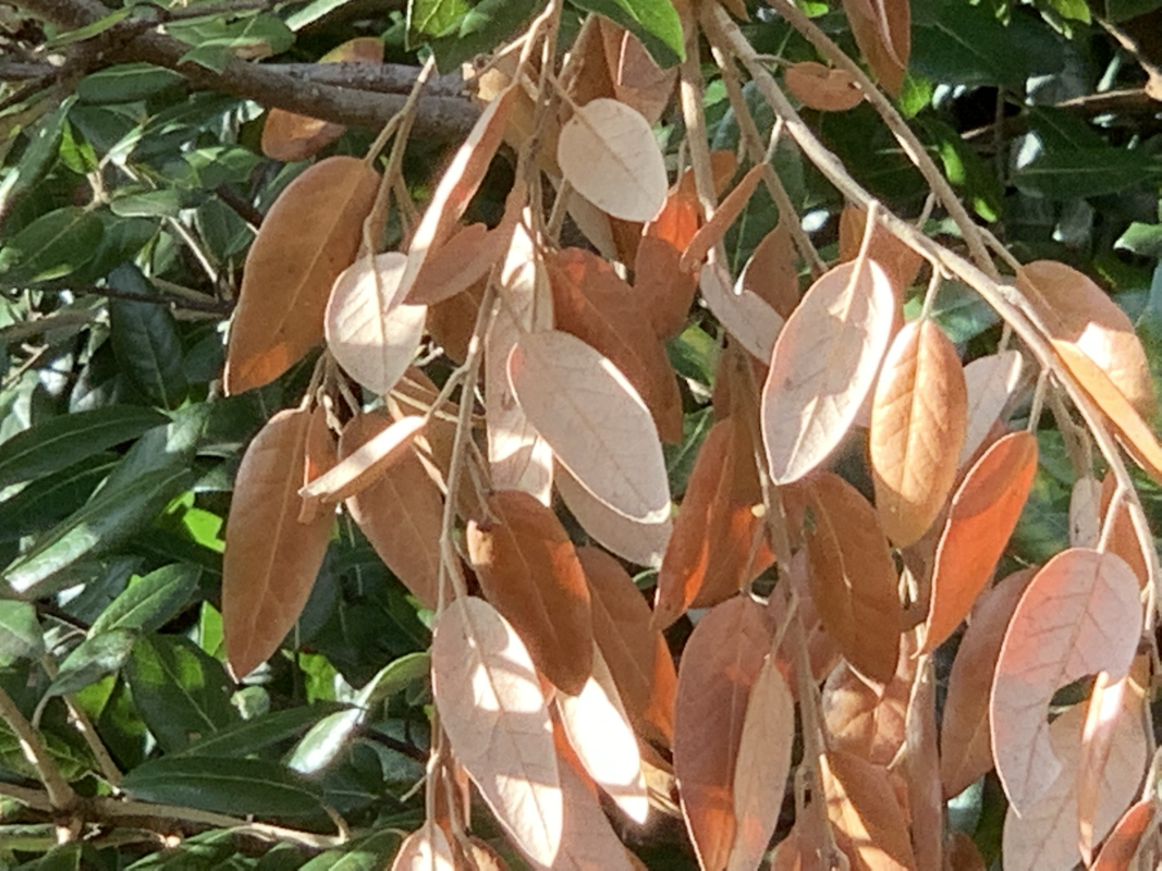
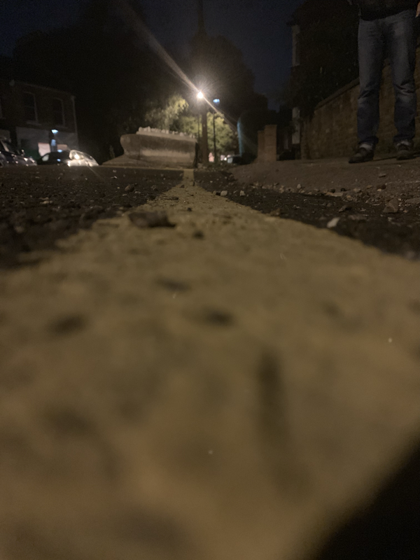
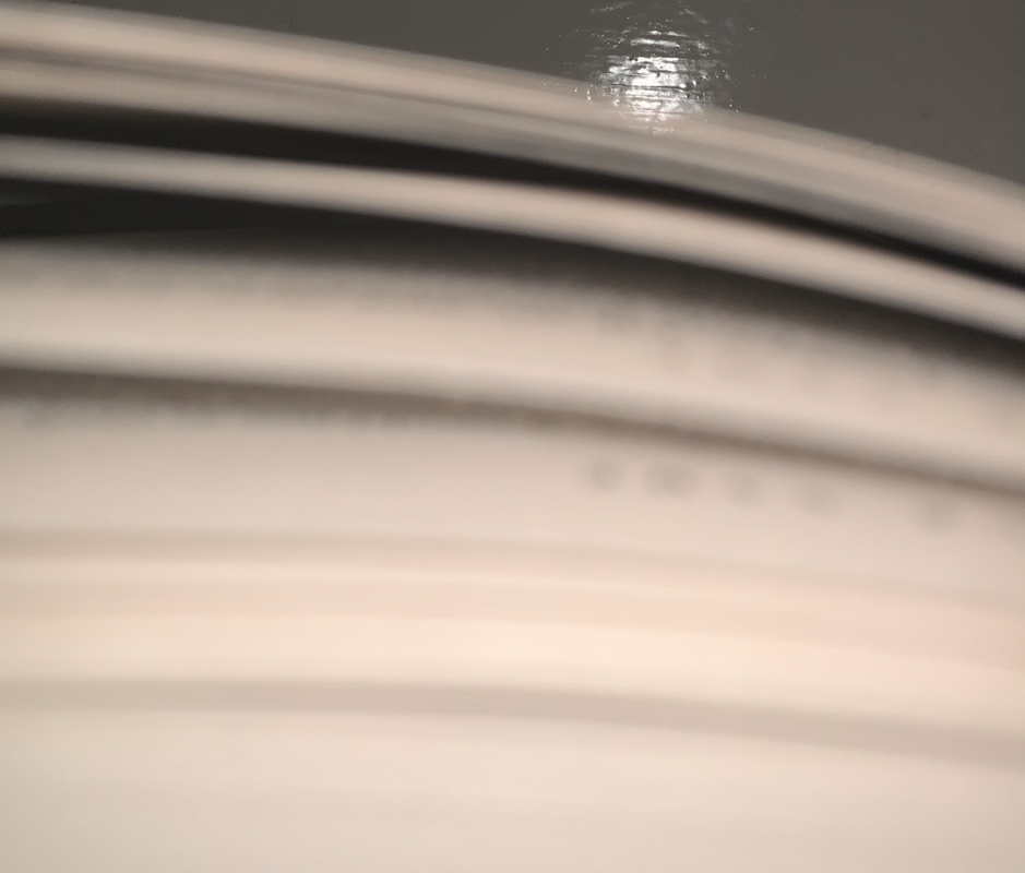
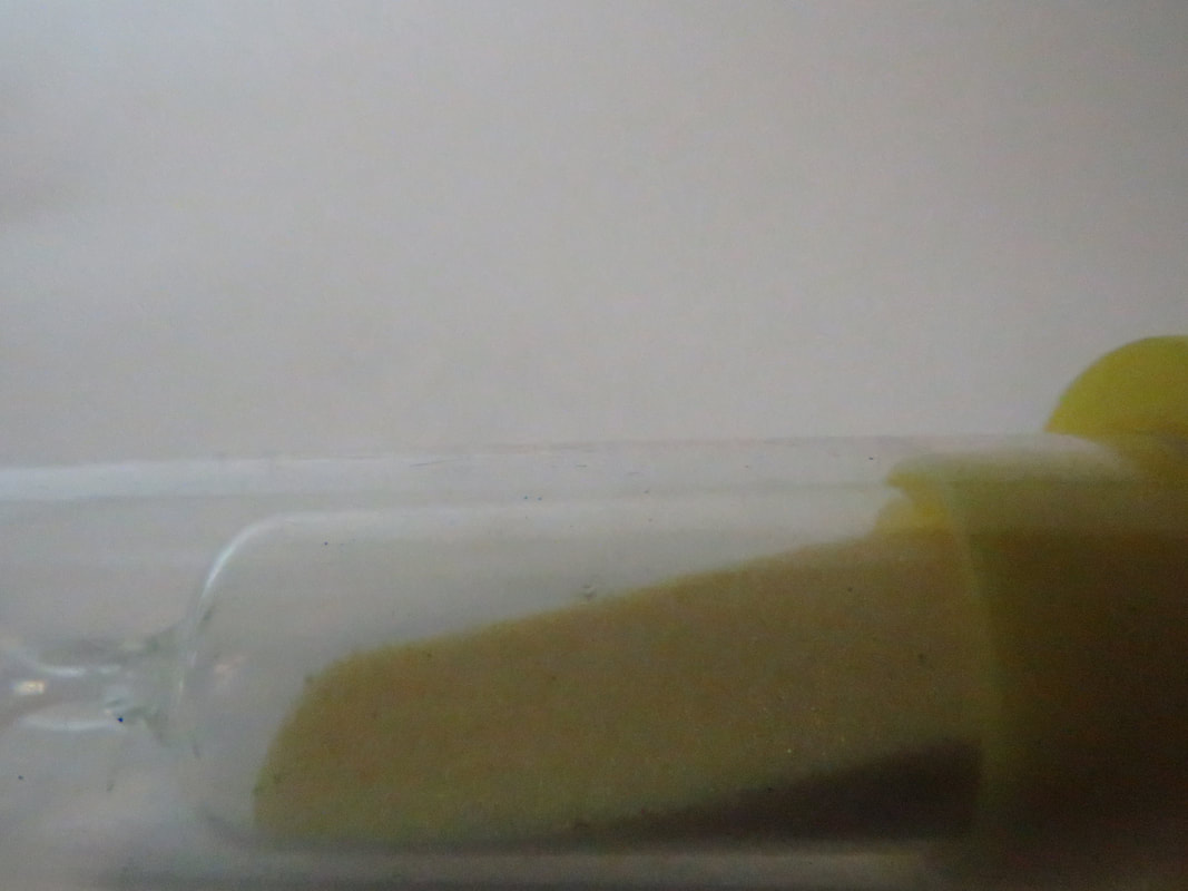
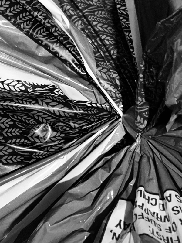
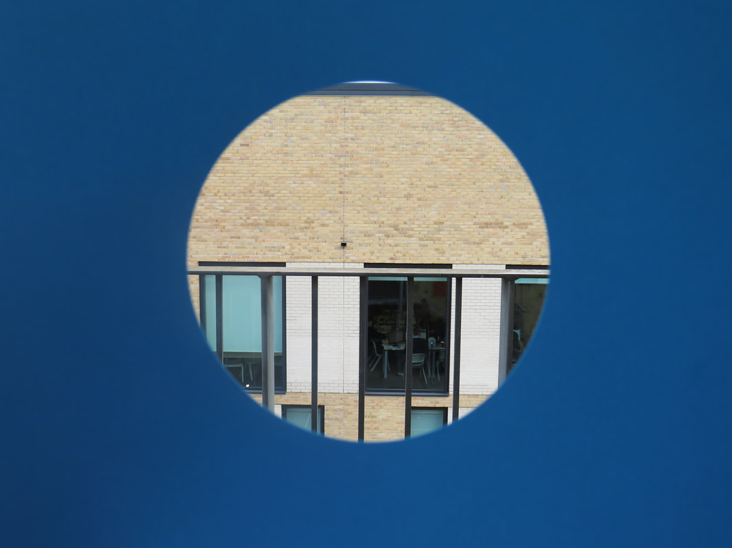
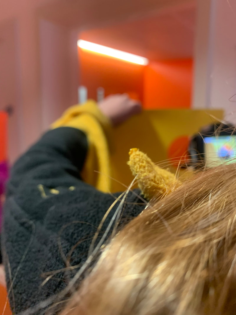
In this task my partner and I were asked to order these photos left to right from most abstract to least abstract. We ordered these by things your most likely wouldn't see day to day to the most likely. Looking back at this I think I would change a couple photos around but all in all I'm happy with the order of these photos.
Most abstract:
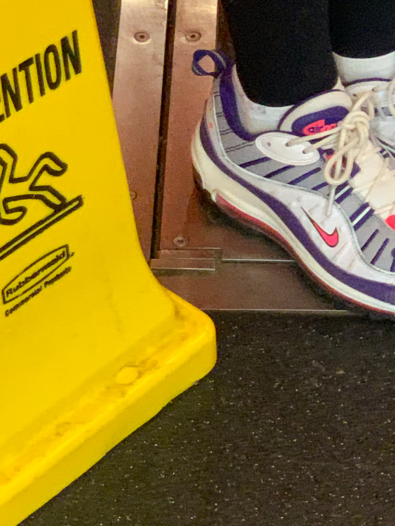
The first photo is the one I found the most abstract because its a bit unsettling and confusing of what completely the reason of taking it was and why the photographer asked for this look to be created and what there vision of the photo was.
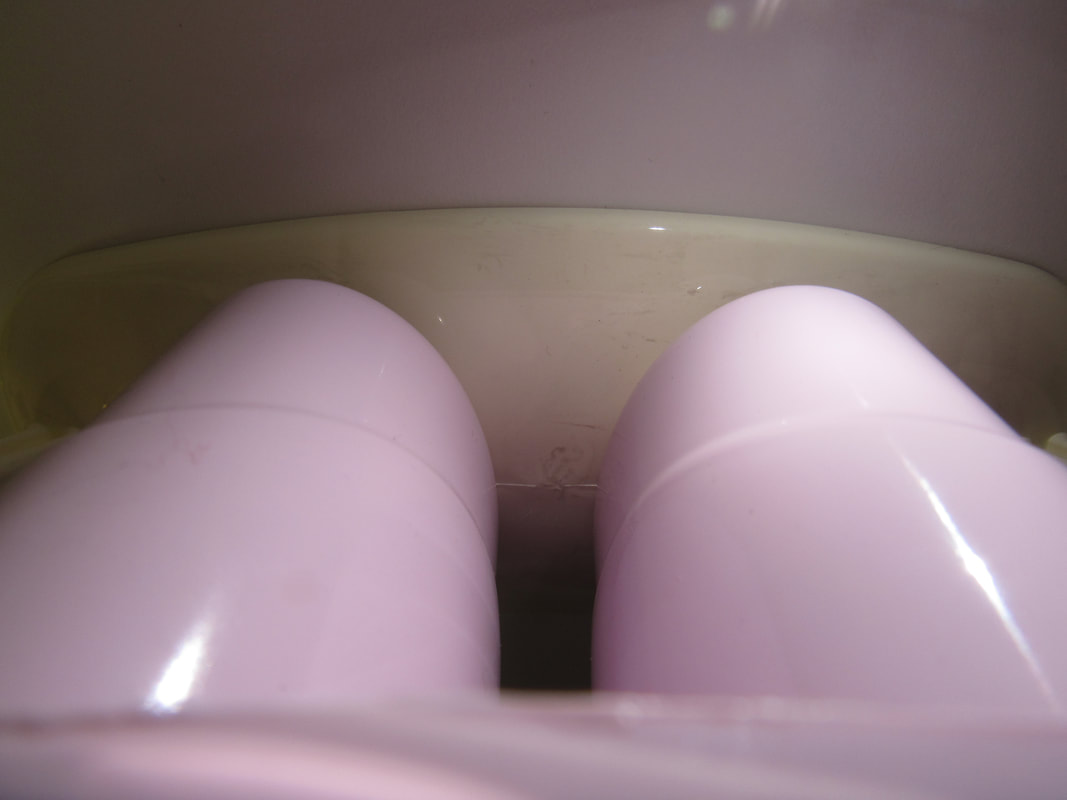
Least abstract:
The last photo I found the least abstract because its the most everyday and ordinary photo out of all of them but that doesn't make it not abstract I just found it the least out of the photos I was given.
Most abstract:
The first photo is the one I found the most abstract because its a bit unsettling and confusing of what completely the reason of taking it was and why the photographer asked for this look to be created and what there vision of the photo was.
Least abstract:
The last photo I found the least abstract because its the most everyday and ordinary photo out of all of them but that doesn't make it not abstract I just found it the least out of the photos I was given.


In this task we were asked to draw a sketch of this photo by Paul Strand and answer a few questions, on this sketch I focused on the tones that the shadows produced and where the light created different shapes. At the bottom of the sheet I answered the questions at the top.
First try of abstract photos:


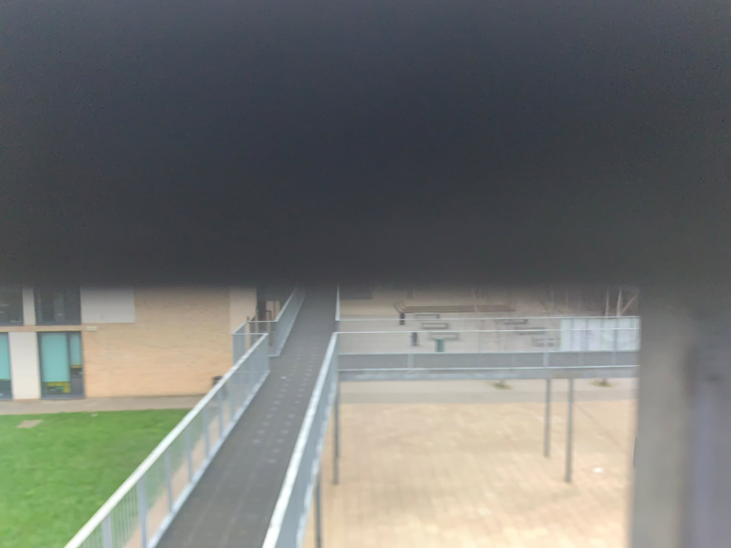
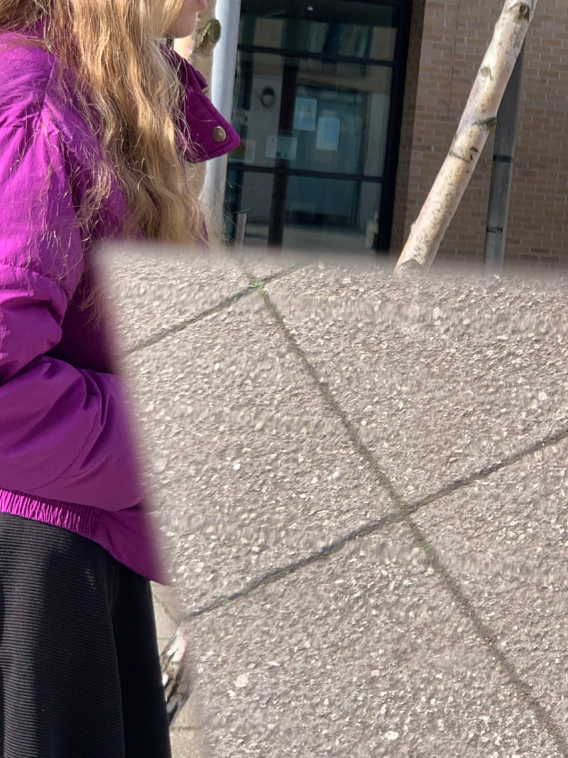
In this practical we were asked to take photos of things that were more or less abstract. I like these photos because although they are of fairly normal things they pick up the question "Why were they taken" and thats one of the reasons abstract can really be of anything because thats the impossible question to answer. If I were to do this again I think I would go to the different blocks and try and find different things and places to take photos rather than just staying in one block and the outside.
Formal Elements:
Focus:Which areas appear clearest or sharpest in the photograph? Which do not?
Light:Which areas of the photograph are brightest? Are there any shadows? Does the photograph allow you to guess the time of day? Is the light natural or artificial? Harsh or soft? Reflected or direct?
Line:Are there objects in the photograph that act as lines? Are they straight, curvy, thin, thick? Do the lines create direction in the photograph? Do they outline? Do the lines show movement or energy?
Repetition:Are there any objects, shapes or lines which repeat and create a pattern?
Shape:Do you see geometric (straight edged) or organic (curvy) shapes? Which are they?
Space:Is there depth to the photograph or does it seem shallow? What creates this appearance? Are there important negative (empty) spaces in addition to positive (solid) spaces? Is there depth created by spatial illusions i.e. perspective?
Texture:If you could touch the surface of the photograph how would it feel? How do the objects in the picture look like they would feel?
Value/Tone:Is there a range of tones from dark to light? Where is the darkest value? Where is the lightest?
Abstract formal elements:


In this second photoshoot I focused on the formal element line.
|
This is my favourite photo because the lines go in many different direction and they layer each other which make an illusion of some of the lines looking further back than others. Also the colour contrast between the black and white makes each of the look more enhanced then if they were all white or all black.
|

|
Abstract Photogram:


For this project we used old photograms to make a new picture, at the beginning I chose to get photos which had a clear photo of a person and to use the cassette player as a window to see the faces of the people and then I also added a back to it (the circular picture beneath the cassette) and then carried on adding shapes and objects such as the light bulb and the two fingers as a space filler and also something to make it more abstract and far away to the original photograms as I possibly could get. After the main centre of the photos to the amount branching from the middle I thought that there was still to much empty space and I wanted to fill it, so I decided to get other peoples scraps and hole punch them to add a fuller effect to the picture without adding big photos to take away from the main focus. Overall I am quite happy with how it came out because of how well the branching off the picture worked and I feel as if it pulled the middle together, if I was to do this again I think I would change the square with the circle in its and the star looking object to something different because I feel as if they are slightly out of place.
Homework:
For this project I’m going to be focusing on taking photos of interesting and things you wouldn’t see normally and also warped photos of something that looks like something else. I would like to try and take photos in places such as parks, central London and places with art like Brixton.
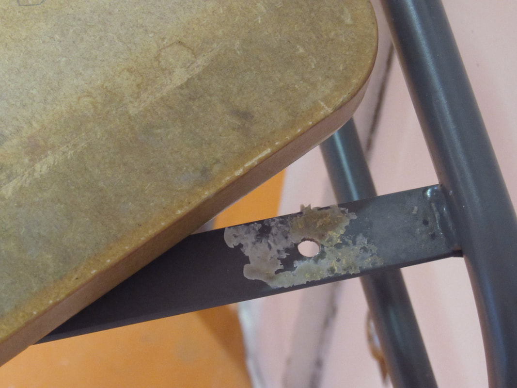
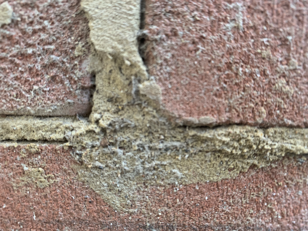
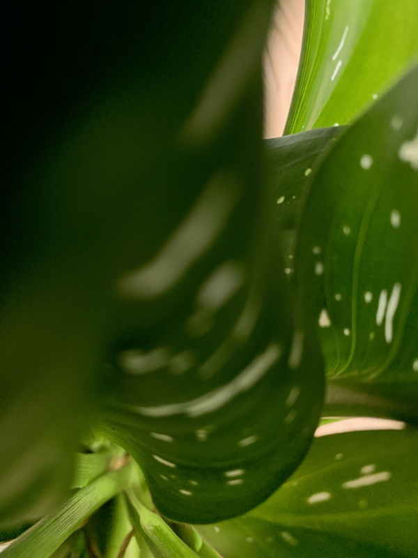
For this piece of homework I wanted to just take photos of anything I found remotely abstract. All of these photos were taken on my phone and all in either my house or my garden, I have taken them both in focus and out of focus to get different types of texture, tone and focus to get a range of unique and contrasting photos.


In the dark room:
First Second Third


In the dark room we used photocopied versions of our photogram compositions and tried to turn the compositions from positive to negative by using an enlarger to time and exposed the completion to light and then developing it in the three chemicals develop, stop and fix, four if you include washing it in water. While making my first one I exposed the photographic paper to 10 second of light but the photogram went too dark so I tried again and used less time and I still wasn't satisfied so I tried a couple more time to an amount where I was happy where it wasn't too exposed but it was exposed enough to see the dark turn light with detail still included. I do like the third one the most because it is bright but the exposure isn't too much to the point where you can't see what is meant to be shown, if I was to do this again I would probably try and make it slightly less bright so I would weaken the light and play with the different times I could do it for.
Formal elements homework:


For this homework we had to chose a formal element to take photos of,I chose the formal element line because if you look closely you can see that everything is made up of line. You can also say that I used focus because it goes from a sharp and focused look at a more blurred and out of focused look.
Starter task:

Patrick Lears photogram
|
This photogram has an aspect of the formal element texture. This can be seen from all the different grounds of the photo (back, mid and front ) in the background they used texture and repetition to get the background, these are the elements I've chose because if you were to reach into the picture you would be able to fell the fern looking back drop and all the edges and organic shapes of it the repetition is because he has layered the fern looking object over each other. For the mid ground he has used texture again and line, this is done by the two dark black lines just out of centre to the photo and the texture is through the bow on a stick which has a shine to it so if you were to touch it it would feel slightly plastic like but a smooth type of plastic.
For the front it is very textured because of the shiny gem looking thing which has been broken which give it a clean cut, but the gem looking thing also looks like it has been edited in because of the boarder around it. His practice: He first started as a photographer, and worked up a lot of black and white prints so in time he would cut them up and and find the main parts of each photo and make a new photo from many old. He would create collages out of these old photos. |

|
Photogram in photoshop:


For this project we used photoshop to create our photogram compositions into a layered duotone. This was done by copying my composition in into photoshop and then going to edit, mode, duotone and the a pallet would show up and you would pick the colour you wanted, after that I would copy in a photo I took in one of my abstract photoshoots and layer that on top of my composition. After I would do that I went down to where it said layer and then normal and clicked on that, then pick one of the many options shown above. I did all of this four different times and these are my results:


Favourite:
My favourite row is the second one because I like how your can see the brick through the composition and how it adds texture and the roughness through the first layer. I also like how the colour doesn't detract from the initial two images and how you can still make out what both of them are. If I was going to do this again I would try out different colours with it and see if the colour make a difference to how you see it.
Another one I like is the forth row because again it has a lot of texture and the look slightly 3D. My favourite out of the row is the first one because it confuses your brain bit because the colours together make the first layer look like its folding over and wrapping around the second layer. I really like how all of these turned out but the ones I have picked are what I think are my better ones.
Another one I like is the forth row because again it has a lot of texture and the look slightly 3D. My favourite out of the row is the first one because it confuses your brain bit because the colours together make the first layer look like its folding over and wrapping around the second layer. I really like how all of these turned out but the ones I have picked are what I think are my better ones.
Thirty photos homework:


This week:
This week I was testing focus and unfocused. I decided this because I could take photos with detail really close or without detail and have a mere blur of what was there before.

|
This is my favourite photo because it has both focus and blur in it. I like how the sparks are seen properly and how my hand is as if its gone really fast and it has been blurred quite nicely.
|
Pictures for final project:


Danfna Talmor Research:

|
Constructed Landscapes:
What you can see in this picture are steep hills and mountain sceneries. The outline of orange and white reminds me of fire and it sightly looks like the mountains are being burnt away. The title 'constructed landscapes' suggests that the photographer has taken different mountains and hills from different areas and places on the mountains to create a new picture and make one big mountain terrain. Talmor might use different locations to get alternative textures, contrast and depth in her constructed versions of theses photos that she creates from many photos. The different photos she has taken and cut up are all from different places around the world and pieced together, all of her pictures are completely made up of nature and taken away all person made thing such as buildings and people by using a sharp knife to cut the negatives to make it only nature, in this case mountains. |
More Dafna Talmor photos:


"Constructed Landscapes transforms colour negatives of landscapes initially taken as mere keepsakes through the act of slicing and splicing. The resulting photographs allude to an imaginary place, idealised spaces or as Foucault states."
Dafna Talmor
Dafna Talmor
Abstract Constructing:


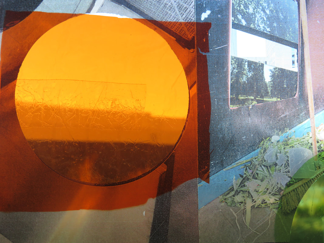


In this project we turned acetate printed photos into collages. We did this to try and replicate but to make it more original and put our own twist on Dafna Talmors work. My favourite collage that I made would be the ones with the circles because its simple but you can see it still has some unique qualities which makes the picture more interesting.
Dafna Talmor practical:
|
|
Today Dafna Talmor showed us how she makes her constructed landscapes with positives instead of negatives (the way Talmor does her constructed landscapes is through coloured negatives not positives.) through a workshop she taught. She talked us through her practice and before she started making her constructed landscapes which was interesting to see how she came about making her constructed landscapes. With mine I wanted to have a theme with each one I made. I didn't stick with the nature theme but I did make sure they had order so it didnt look messy. To achieve the final produce the materials I used we 35mm positive slides, a lightbox, scalpel, cutting mats, coloured cellophane and sellotape. I used these materials and cut ups full positives and constructed them into a newer and more abstract slide. The decision I made weren't very extreme because I had an idea before I started cutting things up (which was having a thereto my images). I think the Tallis habit I used the most was persistence because cutting up all the images it was very fiddly and small so I had to be careful not to accidentally cut something I needed.
|


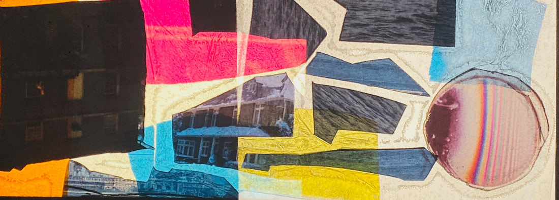


Overall I find my images to be quite abstract because of the shapes, colours and position I put them in. I like how they all have their own individual uniqueness about them and how they are all similar to each other but with different pictures. I learnt that the way Talmor works and how long she takes on each image must be very long and frustrating but overall rewarding when its all finished. If I was to do thing again I think I would try and make more and different styles of slides. In the future I could do this again with my own images but probably not film but instead with thicker paper.
Puzzle ‘em homework:


Puzzled 'em assessment:

|

|
Threshold concept #8
"Photographs consist of formal and visual elements and have their own ‘grammar’. These formal and visual elements (such as line, shape, repetition, rhythm, balance etc.) are shared with other works of art. But photographs also have a specific grammar - flatness, frame, time, focus etc. ‘Mistakes’ in photography are often associated with (breaking) the ‘rules’ and expectations of this grammar e.g. out of focus, subject cropped, blur etc. Some photographers enjoy making beautiful images but others are more critical of what beauty means in today's world." |
This 1950/60s game is a photography game where all the photos are taken from obscure angles to confuse the players guessing the objects, some objects in the game are no longer produced making it a challenge for players in the 21st century. For this assessment we are going to use the concept of the game to create our own photos and possibly turns it into a game if time is left at the end of the allocated time to do this project.
Two photographers who tested and created obscure photos were Salvador Dali and Brassai who were looking at the use of surrealism.
First Puzzled 'em photos:


In todays lesson we took photos of everyday objects and tried to distort them to make them look different to what they originally would be seem as. To get these photos I placed these objects on a plain background and used the macro setting on the camera to get a close up of the different objects without it stopping focusing. These were the final produce of that lesson, my favourite one would be the last one which is a shower cap and its my favourite because the shadow it makes, makes it more abstract then if it was just the cap which I think gives it a nice effect and makes it harder to make out what it actually is.
Puzzled 'Em continuation:
Photoshop:
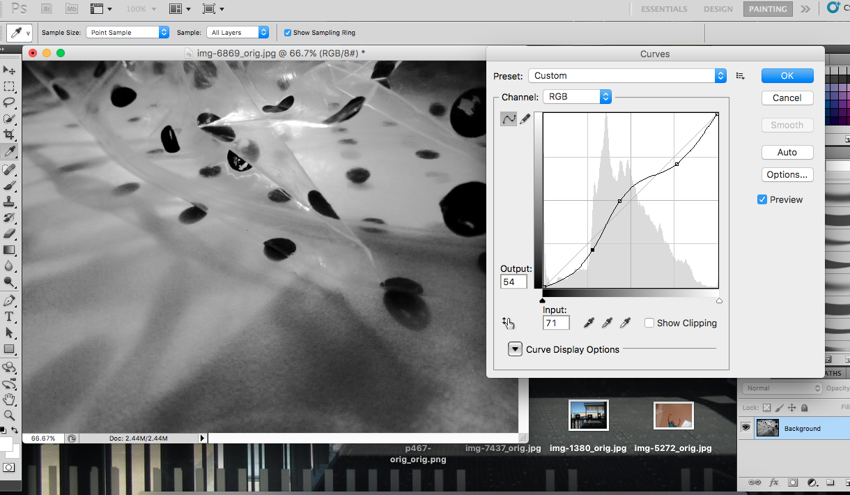
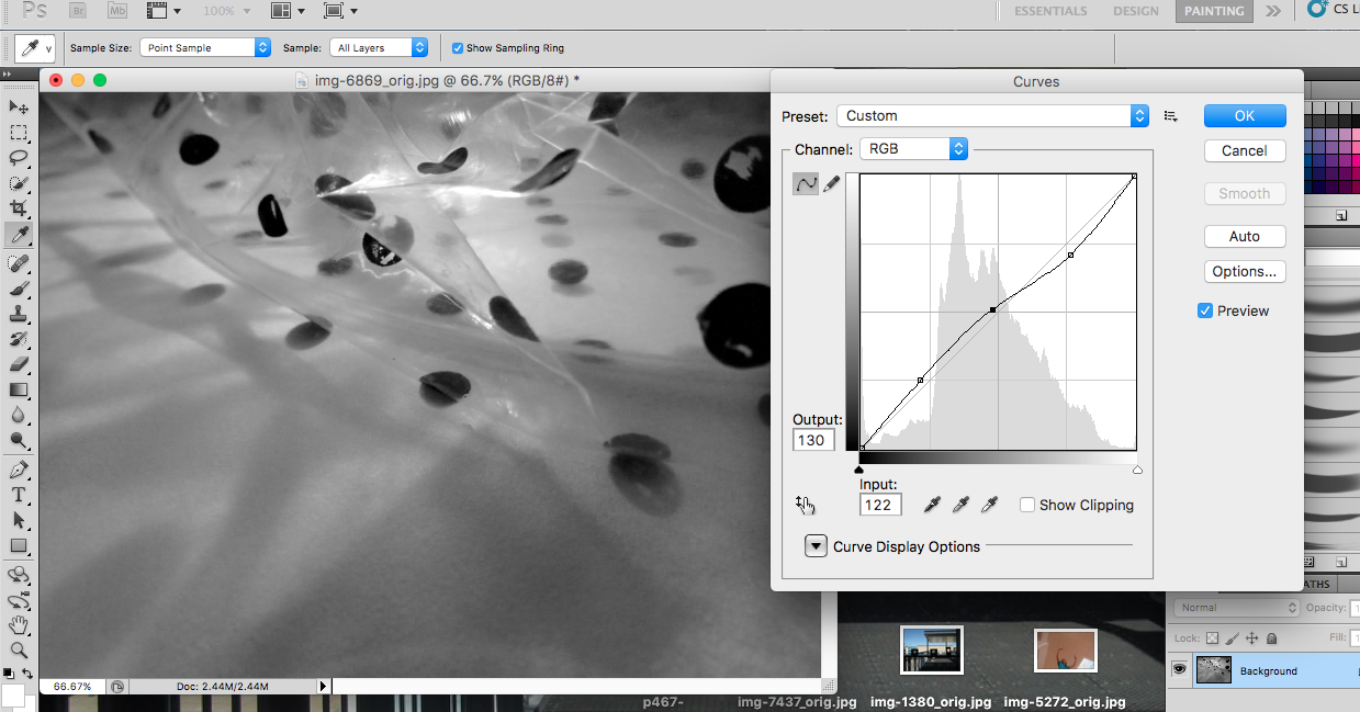


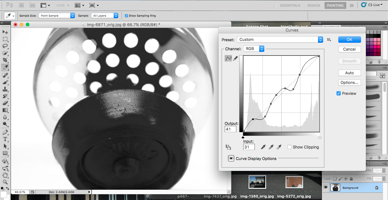


In todays lesson I took the photos from last week and inverted them into black and white using photoshop. I used the tool 'curves' to adjust where the picture would be darker and lighter changing the tonal value of the image, this makes the image harder to identify. Then I took the tool 'threshold' and took away all the grey tones making it more abstract and even harder to identify.
More Puzzled 'Em photos:


These are more photos of object that I took in class for my puzzled 'em project. I tried to take them from abstract angles to confuse the viewer and then later inverted them into black and white.
Artists:
Involuntary Sculptures by Brassai 1932
This project was made in collaboration with the surrealist Salvador Dali, where they took everyday objects and made each of them into something momentarily different and unidentifiable for that second in the photograph. These photos were made by placing they objects on either a piece of white paper of a sheet of glass and to take a photo form different angles and get a shadowed affect to distort it. This relates to his other work because it plays with the viewers perspective of the image.
This project was made in collaboration with the surrealist Salvador Dali, where they took everyday objects and made each of them into something momentarily different and unidentifiable for that second in the photograph. These photos were made by placing they objects on either a piece of white paper of a sheet of glass and to take a photo form different angles and get a shadowed affect to distort it. This relates to his other work because it plays with the viewers perspective of the image.

|
To me this image baffled me because its quite a organic shape and took me a white to identify what it was but after a while I realised that it was just toothpaste smeared on a sheet of glass to reflect against the glass and confuse the viewer. It helps me think about my Puzzled 'em project because it has given me ideas on how to display my objects on glass to make it harder to identify.
|
'A series of disappointments' by Stephen Gill 2008
This was displayed as a book and he has taken different objects and photographed them from a high up angle, but with each object he has twisted of folded it to make it more unrecognisable to the viewer. I think these were made because they are the things most people would throw away therefore the 'disappointments' and he has taken them and made into something more interesting.
This was displayed as a book and he has taken different objects and photographed them from a high up angle, but with each object he has twisted of folded it to make it more unrecognisable to the viewer. I think these were made because they are the things most people would throw away therefore the 'disappointments' and he has taken them and made into something more interesting.

|
I quite like this image because it is something everyone probably just has lying around somewhere and no-one even thinks about them but when they are put into a more interesting position they seem to become more fascinating.This could help me with my Puzzled 'em project by just taking everyday mundane objects and make them more interesting.
|

|
Material by Peter Fraser 2002
Peter fraser worked around the world on many different technology sites. Fraser would photograph "low status material" underneath his bed,the behind of his refrigerator and many other 'forgotten' places to take these photo. After numerous months of working with the idea of these awkward and forgotten places he started to begin to work with the taking images of his equipment in laboratories. I really like how vivid his images are, and how they've been taken in such way making the photos look so in focus and bright while being so close to the object in the photo. I find the way he takes photos interesting and would like to try and imitate photos like these in the puzzle 'em project. |
Photos at home:
These are photos I took in my house, they are objects many people would use daily. I decided to invert my coloured photos into black and white because I feel like it looks more sleek and difficult to tell what it is. I like these photos because I think they are the best ones I have done yet because they are nicely focused but some seem different to what they actually are therefore puzzling the view as intended.


Puzzle 'em evaluation:
To make a photo hard to recognise and more abstract you can use camera angles to warp and distort the photo to make it


Saul Leiter:
'I don’t have a philosophy. I have a camera. I look into the camera and take pictures. My photographs are the tiniest part of what I see that could be photographed. They are fragments of endless possibilities.'
Saul Leiter
I like this quote because I feel like it conveys what his work is the best, it’s almost as if he is saying his camera is not only for photos but also for interpreting the endless possibilities of what life is. I also like how he has said that although he’s photos are only fragments of the world around him but is saying one possibility he sees of what is going on in the photo is completely different to someone else.


These are my interpretation of two of Saul Leiters photographs. the first one is one of my favourite photos of his because i like the blocking of the photo and how it like a snippet into the world around of people doing everyday activities. The second painting was a bit harder because it was on of his photos where he is taking it though a water droplet window but the way it came out although not the same conveys what think to be t]very similar with the blurring and dragging of the paint. I found this activity to be quite insightful into his work.


Saul Leister was a photographer in New York, he left for New York at 23 to go to art school but ended up pursuing photography. He photographed during 40s and the 50s and greatly contributed to the school of photography with his work. He would take photos of people in East Village of Manhattan doing everyday things but he experimented with negative space and not having a clear subject in his photos made his work more abstract and entertaining to the eye. His work was full of vibrated and contrasting colours and it looks as if he used a` gird to take photos with horizontal, vertical and diagonal line that cut up his photos for you to almost be able to read them.


For these photos I like how many of them have blurred in certain spots while keeping in focus in others. I used my phone in these photo to get more detail and to be able to fit the camera in ways i wouldn't be able to do with a big camera. For a proper first attempt I'm quite happy with how these came out however they don't give my the same feel as Leisers photos so next time im gong to try and get more of a feel of what he does better when i next take photos..
Homework
WWW: I think that my photos show aspects of Leisters photography with my own personal take on it which i think make them more modern and to this time. I quite like the contrast between the Saul Leisters photos and mine because there are similarities and differences which make both their own original thing.
EBI: I think I could have used blockers in front of my camera to blur better and give less of an obvious subject. The photos aren't my favourite one that i have taken in this project because of how ordinary they look.
EBI: I think I could have used blockers in front of my camera to blur better and give less of an obvious subject. The photos aren't my favourite one that i have taken in this project because of how ordinary they look.
More Saul Leister inspired photos:


|
|
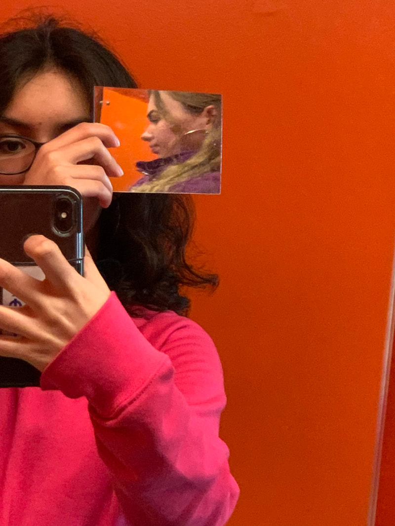
This is my favourite photo that I took today because it looks unusual. I like how out of place everything seems , for example in the background everything is tilted slightly to the right however the subject in the photo (the person) is a lined with the edge of the camera which makes her to not be tilted. I also like how the angle of the mirror got to captured the ground and how it looks as if I have taken that fragment out from where it goes and rearranged it to what it is now. Although it isn't strictly the same as what Leister did it is the same concept where hes blocked of an area to make the focused part seemingly less important then what others would deem to be the more interesting and important part and made the less important look better then it is. If i could change one thing about this picture I think I would slightly move the mirror to the left to cover what is being held in the persons hand, other than that i wouldn't change anything about this photo.
|
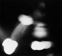
Ralph Eugene Meatyard:
The photographer Meatyard has similar ideas when it comes to taking photographs as Leister has, and by that they both uses abstraction as a big part of their photography. While Leister only partially disrupts the view by blocking specific parts of the picture he is taking, In Meatyard's 'No-Focus' gallery he is disrupting the whole photography by using blur taking away a focused subject that could draw the eye to it. In his 'No-Focus' gallery he uses black and white as well as the grey scale to possibly make it harder for the viewer to distinguish what it is in the background however he has also used depth by using the light to make objects seem further forward or back depending on where the light has been shown. When it come to being more or less abstract then Leisters work it is hard to say because although they are both using abstraction in there photography, how they use that abstraction is completely different and therefore cannot elect one to be the more abstract of less.